Case Study:
STANDARD GOODS // E-commerce site - Redesign
I worked on this project independently while on a UX Design Program at General Assembly.
Designers were given an existent e-commerce site of a store, and a Persona to work with.
StandardGoods.com is the e-commerce site of a hipster clothing store in Capitol Hill (Seattle, WA).
The site sells curated man-focused clothing and cool items.
Their product line is based on expensive brands, which mostly are from the USA, and North West made brands.
Timeframe: 2-week sprint
CHALLENGE
Improve the usability of the site to increase online sales.
REQUIREMENTS
Target device: Desktop
E-commerce platform: Shopify
APPROACH
Emphasize factors that will incline users toward purchasing from a small local company that resale items.
Help users to browse easily between organized sections, with clear product categories and concise descriptions.
Improve the Check-out process.
RESEARCH
The company: StandardGoods
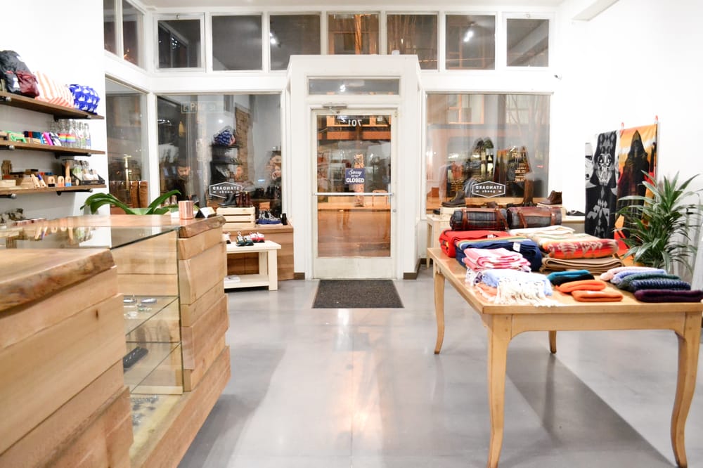
StandardGoods store in Capitol Hill.
The company’s brick-and-mortar store is located in Capitol Hill (Seattle, WA). It’s a well-organized man-based hipster apparel store and its windows shop summarizes the mix-theme of items that the store carries.
On the first visit, I understood that there is a disconnection between the physical store and its website because the first has a clean layout and it’s well sectored. The store has clothing, footwear, accessories (for men and women), cool gadgets, postcards, and decoration items. However, the e-commerce site is organized by Men, Women, Brands, and uncategorized gift items.
After analyzing StandardGood.com, I understood that other well-known e-commerce sites, such as Nordstrom.com and Amazon.com, sell the same products, as well as the sites of the brands themselves.
A quick comparison of StandardGoods.com with other clothing e-commerce:
Advantages:
- Offers curated items (online customers need to choose between products that were already selected as best options)
- Provides personal communication (between customers and the store by phone or e-mail)
- Supports the local economy
Disadvantages:
- Lack of competitive prices
- Low variety of the same product
- Lack of additional services (faster shipping options, gift packages… that bigger companies offer)
- Security concerns (buying from an unknown company)
PLANNING
Persona
Edda is a Standard Goods existing customer, who lives in the suburbs and she is used to buying presents for her son Luke (a 25-year-old Software Engineer who lives in Capitol Hill (Seattle, WA.)
She prefers to buy from the stores near where her son lives and carry the brands and the style her son likes.
She is overwhelmed with the amount of clothing options that chain stores offer, and she finds it convenient for her son, that in case he needs to exchange something, he can manage the exchange in his neighborhood.
What Edda needs in an e-commerce site:
Competitive and comparative analysis
After comparing the StandardGoods site with other similar e-commerce sites, I found the following problematic areas:
Scenario and Storyboard
1) After Edda receives a "Free Shipping" e-mail promotion from the store, she thinks it is an excellent opportunity to buy a gift for her son for the holidays.
2) She goes to Standard Goods.com, looks for the Men's section, and
3) She is interested in the Bags category. Once the List of products is displayed, she knows that her son likes specific Brands, and he needs a specific Type of bag (a laptop bag, that works for everyday use and that also can look fashionable for happy hours after work.)
4) Once she read the Product's details, she feels convinced with the item, and finally, she proceeds with the Checkout Process.
5) After a week or so she will have, at her house, the gift ready for her son.
DESIGN
I passed my ideas from sketches to wireframes and then annotated them. After that, I created a paper prototype, then an interactive prototype to test it with users, and gather feedback from them to iterate my design idea.
My prototype went through one round of testing with users, and I followed the design's iterations for improvements.
I used OmniGraffle for wireframing and Invision for testing it with users.
Homepage
Products page
Product details page
Check out process
USABILITY TESTING
Interactive prototype
I created an interactive prototype (using Invision App) to test my design with users and gather information about the areas that can be improved.
Users feedback
Users were confused about some specific areas, meaning that the following changes are required:
Increase categories for filtering on the "Sorting Box"
Consider adding a "Quick View" option for products
Consider adding a “Save Information” option to store the type of payment
NEXT STEPS
I strongly suggest the creation of the “About Us” section in order to improve the website's legitimation with the sum of the store's story. Also, highlights the value that these small companies have for their customers and the trajectory of the people behind these companies. In my opinion, those are attributes that make this kind of small business unique and different from more prominent retailers.
Further user testing will be needed, to see if users succeed in browsing the site, searching for products, and getting all the information they need to feel convinced to make a purchase finally.
An increase in online sales, as well as other success metrics, must be taken into account.


