Case Study
BIDMATCH // UX/UI Design for website
I worked on this project on a short-term contract basis with a Seattle startup company in partnership with another designer: Andy Hira.
BidMatch is a platform that connects homeowners with contractors in a specific area; where homeowners can submit the projects they wish to have done and contractors can bid on them.
My role:
Project planning
Research: user interviews, competitive analysis, affinity diagram
Planning: user journey, design guidelines
Design: sketches, wireframes, hi-fi mockups of "Home Page" and "My Projects" sections
Usability testing
Iterative improvements
Timeframe: 3-week sprint
CHALLENGE
Improve homeowners’ experience during the hiring process.
In order to give an accurate quote, contractors need a bunch of information from homeowners (blueprints, pictures, measures, descriptions, materials, etc.) without having to meet the client personally. On the other side, homeowners cannot always provide all the information required through a website, because homeowners might not understand professional terms, are overwhelmed by options, etc. Besides that, once homeowners get bids from contractors, they need to evaluate lots of relevant information about the contractors (trust, work quality, experience, budget, etc.)
Goal: focus on the "trust and communication” aspects between homeowners and contractors.
APPROACH
Learn about the user.
Hiring a contractor is a process that requires evaluation and knowledge of the homeowner. It is fundamental to learn about the different stages, needs, habits, and pain points of homeowners during the whole process of hiring a contractor.
Conduct market research.
Learning about “what” other sites offer and “how” these sites offer the service of finding a contractor online gave us the starting point to understand the options that homeowners customers currently have in the market.
MVP (Minimum Viable Product) requisites.
HOME PAGE: it will also work as the - Portal - to register contractors on the site.
FORM: designed in a way that will help homeowners feel more - informed - about the quote request they’ll submit.
BIDDING E-MAIL: it will tie together the whole - hiring experience - of the site. It needs to enable homeowners to evaluate contractors easily and faster.
Goal: present to our client the - Ideal User Experience - of the site, along with the UX/UI Design Guidelines to start building the platform.
RESEARCH
Business goals
Know the user
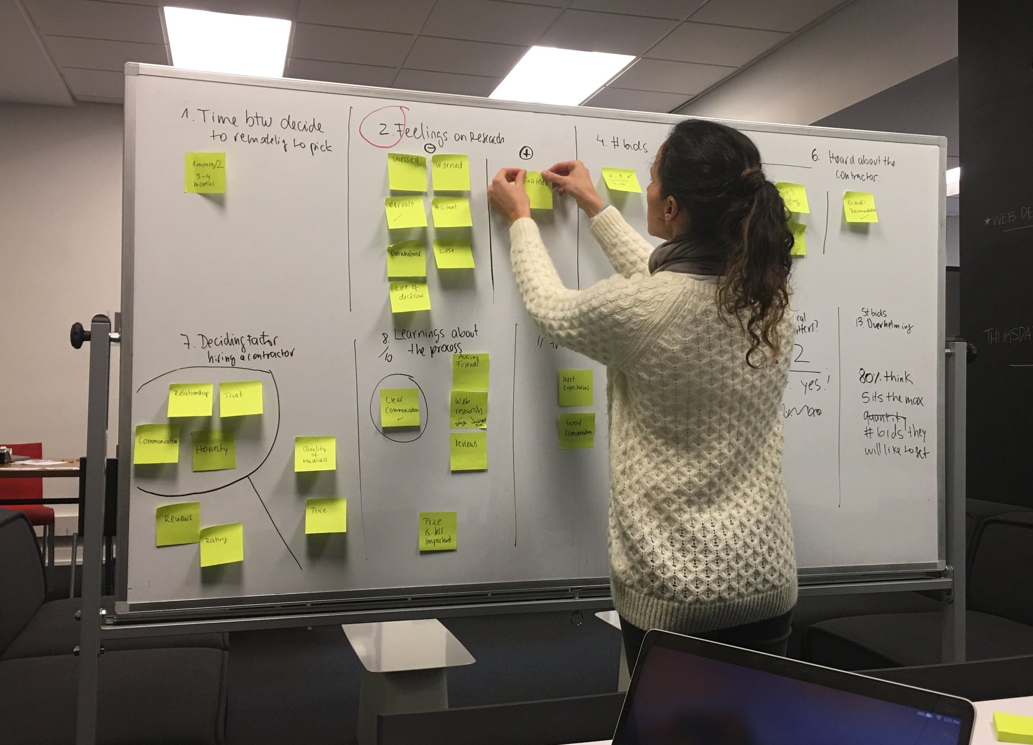
To understand our potential users, we sent out a survey to our network, to learn about their experience in "hiring a contractor."
We also interviewed ten people in-person to learn more in-depth about their stress points around hiring, dealing with, and working with a contractor.
With this information, we were able to develop a primary persona for the BidMatch website.
Persona
Katie
45 years old | Director of Human Resources
She is excited about starting remodeling her house, and she has been collecting ideas and asking for recommendations about the renovation of her kitchen.
Data analysis
It was fascinating to see surprising data through the analysis of the survey and the results of the interviews. In some cases, findings in the survey were supporting the interviews, and vice versa.
SURVEY RESULTS
INTERVIEWS PATERN'S ANSWERS
User journey
Competitive analysis
Most sites offer:
Ability to compare local contractors
Screening background
Most sites don't offer:
Ability to upload pictures for submitting a project
Concierge service
DESIGN
We tried to balance business goals with user needs, and combine them with the best design practices we learned from other sites in the same industry.
VOICE AND TONE
Trust
Legitimation
Clarity on the process
Reliability
STYLE GUIDE
Simple and clean layout
Enough white space
Provide help and details in chunks of information
BRANDING
We created a brand identity and a color palette: blue as the primary color, and orange as the accent color.
DESIGN OF PLATFORM'S COMPONENTS
We evolved our designs from paper sketches to low-fidelity wireframes and high-fidelity mock-ups using Sketch App.
HOME PAGE
Strategy: Transparency and legitimation of the site, through the following elements:
Cost guide / Social proofs / Contact links
How it works: using icons + a short description of each step
Validation: photos of projects done in the area + short review (client's name, city/neighborhood)
Engaging image: inviting -Pros- to register, and also transmitting value for homeowners
Types of services offered: option to expand all the services on the same page (not redirecting)
Educative section: with the -Learn More- option
FORM
BIDDING E-MAIL
PROTOTYPE, TESTING, AND ITERATION
We tested our designs with a paper prototype, and based on users' feedback we made the following changes:
The colors and text’s size were changed to improve legibility and avoid confusion
The verbiage on buttons was improved to avoid confusion
Unnecessary buttons and unclear questions were removed
Features were added
NEXT STEPS
Additional user testings
More research about user and competition
Expand user account features
Design the "Contractor-side" web tool


